Understanding color theory is essential for anyone working in visual arts, design, or any field that relies on visual communication. Whether you are a web designer, artist, or marketer, mastering color theory can help you make more effective and appealing designs. This guide will walk you through the basics of color theory, its importance in web design, and how to choose and use color schemes effectively.
What Is Color Theory?
Color theory is a body of practical guidance to color mixing and the visual effects of specific color combinations. It involves the study of colors and how they interact with each other. At its core, color theory covers the principles and guidelines for creating harmonious and effective color combinations.
The Basics of Color Theory
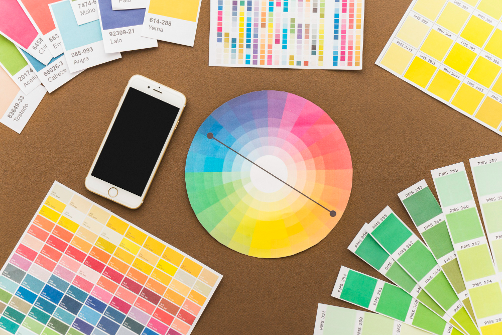
- Color Wheel: The color wheel is a circular diagram that represents the relationships between colors. It is divided into primary, secondary, and tertiary colors.
- Primary Colors: Red, blue, and yellow. These colors cannot be created by mixing other colors.
- Secondary Colors: Green, orange, and purple. These are created by mixing two primary colors.
- Tertiary Colors: These are created by mixing a primary color with a secondary color, such as red-orange or blue-green.
Why Is Color Theory Important in Web Design?
Color theory plays a crucial role in web design as it directly impacts the user experience. The right color scheme can make a website more attractive, improve readability, and enhance the overall user experience. Here are some reasons why color theory is important in web design:
- Aesthetic Appeal: Colors can make a website visually appealing and attract visitors.
- Brand Identity: Consistent use of color can reinforce a brand’s identity and make it more memorable.
- User Engagement: Proper use of color can guide users’ attention and influence their actions on the website.
- Readability: Good contrast between text and background colors improves readability and accessibility.
- Emotional Impact: Colors evoke emotions and can create a specific mood or atmosphere on the website.
Color Theory 101
Additive & Subtractive Color Theory
Color theory can be divided into two main types: additive and subtractive.
Additive Color Theory
The additive color theory deals with light and how colors are created by mixing different wavelengths. This is primarily used in digital media, such as computer screens and televisions.
- Primary Colors: Red, green, and blue (RGB). These are the colors of light that can be combined to create other colors.
- Color Mixing: When these colors are mixed, they create secondary colors: cyan, magenta, and yellow.
- White Light: Combining all three primary colors in equal amounts creates white light.
Subtractive Color Theory
Subtractive color theory deals with pigments and how colors are created by absorbing (subtracting) certain wavelengths of light and reflecting others. This is used in traditional art and printing.
- Primary Colors: Cyan, magenta, and yellow (CMY). These are the colors of pigments that can be combined to create other colors.
- Color Mixing: When these colors are mixed, they create secondary colors: red, green, and blue.
- Black: Combining all three primary colors in equal amounts ideally creates black, although in practice, it often results in a dark brown or muddy color. In printing, black (K) is added to the CMY model to form CMYK for more accurate color reproduction.
The Meaning of Color
Colors have different meanings and can evoke various emotions. Understanding these associations can help you choose the right colors for your design.
Red
- Meaning: Passion, energy, danger, excitement.
- Usage: Often used to grab attention and create a sense of urgency.
Blue
- Meaning: Trust, calm, stability, professionalism.
- Usage: Commonly used in corporate designs and to create a sense of security.
Yellow
- Meaning: Happiness, optimism, warmth, caution.
- Usage: Used to create a cheerful atmosphere and draw attention.
Green
- Meaning: Nature, growth, health, tranquility.
- Usage: Frequently used in designs related to nature and health.
Orange
- Meaning: Creativity, enthusiasm, warmth, caution.
- Usage: Used to create a playful and energetic vibe.
Purple
- Meaning: Luxury, creativity, wisdom, spirituality.
- Usage: Often used in designs that convey a sense of luxury and sophistication.
Black
- Meaning: Power, elegance, mystery, sophistication.
- Usage: Commonly used for luxury products and to create a strong impact.
White
- Meaning: Purity, simplicity, cleanliness, innocence.
- Usage: Used to create a minimalist and clean design.
The Seven Color Schemes
Color schemes are combinations of colors that work well together. Here are seven classic color schemes based on the color wheel.
1. Monochromatic
A monochromatic color scheme uses variations in lightness and saturation of a single color. This creates a cohesive and harmonious look. Monochromatic schemes are soothing and easy on the eyes, making them ideal for designs that require a calm and clean aesthetic.
2. Analogous
Analogous color schemes use colors that are next to each other on the color wheel. This creates a serene and comfortable design. Analogous schemes are found in nature and are pleasing to the eye. They lack the contrast of complementary schemes but are often very harmonious and pleasing.
3. Complementary
Complementary color schemes use colors that are opposite each other on the color wheel. This creates a high contrast and vibrant look. Complementary schemes are bold and dramatic, making them perfect for designs that need to stand out. However, they can be jarring if not balanced properly.
4. Split-Complementary
A split-complementary color scheme uses a base color and the two colors adjacent to its complementary color. This provides high contrast without the tension of a complementary scheme. Split-complementary schemes are a good choice for beginners because they are easier to balance than complementary schemes while still offering strong visual interest.
5. Triadic
Triadic color schemes use three colors that are evenly spaced around the color wheel. This creates a balanced and vibrant look. Triadic schemes are great for creating a colorful yet harmonious design. They are balanced and offer plenty of contrast without being as bold as complementary schemes.
6. Tetradic (Double Complementary)
A tetradic color scheme uses two pairs of complementary colors. This provides plenty of color variety and allows for rich and dynamic designs. Tetradic schemes are the most colorful and offer a wide range of color combinations, but they can be challenging to balance because of the multiple colors involved.
7. Square
A square color scheme is similar to the tetradic, but the four colors are evenly spaced around the color wheel. This creates a balanced and diverse palette. Square schemes are balanced in terms of color temperature and can be very dynamic, but like tetradic schemes, they require careful management to avoid overwhelming the design.
How to Choose a Color Scheme
Choosing the right color scheme for your design can be a daunting task, but here are some tips to help you get started:
Understand Your Audience
Consider the preferences and emotions of your target audience. Different colors can evoke different responses depending on cultural and personal factors. For example, while red might evoke excitement and passion in one culture, it could signify danger or caution in another.
Define Your Brand Identity
Your color scheme should align with your brand’s personality and values. Think about the message you want to convey and how colors can support that. For example, a brand that values eco-friendliness might use greens and browns, while a tech company might prefer blues and grays.
Consider the Context
Think about where and how your design will be used. For example, colors that work well on a digital screen might not translate as effectively to print. Similarly, a color scheme that looks great on a mobile app might not be as effective on a billboard.
Use Color Theory
Leverage the principles of color theory to create harmonious and effective color combinations. Experiment with different color schemes to see what works best. Don’t be afraid to try something bold and unusual; sometimes the most striking designs come from unexpected color combinations.
Test and Iterate
Test your color scheme in different contexts and gather feedback. Don’t be afraid to make adjustments based on what you learn. The best designs often come from a process of continuous improvement and refinement.
Color Tools
Several tools can help you choose and implement color schemes effectively. Here are some popular ones:
Adobe Color
Adobe Color is a powerful tool that allows you to create and explore color schemes. It offers various modes, including analogous, monochromatic, and triadic. You can also extract color themes from images, which is great for creating schemes based on real-world inspiration.
Colors
Coolors is a user-friendly color scheme generator that lets you create, save, and share palettes. It offers a range of customization options and is great for quick inspiration. You can lock in certain colors and let Coolors generate the rest of the scheme for you.
Paletton
Paletton is an interactive color wheel that helps you create harmonious color schemes. It provides a range of presets and allows for easy experimentation. You can view your color scheme in various contexts, such as light and dark backgrounds, to see how it will look in different situations.
Color Hunt
Color Hunt is a curated collection of beautiful color palettes. It’s a great resource for finding inspiration and exploring new combinations. The palettes are created by users and rated by the community, so you can see which combinations are most popular.
Colormind
Colormind uses AI to generate color schemes based on your input. It can create palettes from scratch or harmonize colors based on a given image. This is a great tool for finding unique and modern color combinations.
Conclusion
Understanding color theory and how to apply it can greatly enhance your designs, whether you are working on a website, a marketing campaign, or any other visual project. By mastering the basics of color theory, you can create visually appealing and effective designs that resonate with your audience. Use the principles and tools discussed in this guide to explore and experiment with color, and you’ll be well on your way to becoming a color theory expert.
FAQs
- What is the difference between additive and subtractive color theory?
The additive color theory deals with light and is primarily used in digital media. It involves mixing red, green, and blue (RGB) light to create other colors, with all three combined to produce white light. Subtractive color theory deals with pigments and is used in traditional art and printing. It involves mixing cyan, magenta, and yellow (CMY) pigments to create other colors, with all three combined ideally producing black.
- How do I choose the right color scheme for my brand?
To choose the right color scheme for your brand, start by understanding your audience and their preferences. Define your brand’s identity and the message you want to convey. Consider the context in which your design will be used. Use color theory principles to create harmonious and effective combinations. Experiment with different schemes and test them in various contexts, gathering feedback and making adjustments as needed.
- Why is color contrast important in web design?
Color contrast is crucial in web design because it affects readability and accessibility. Good contrast between text and background colors ensures that content is easily readable by all users, including those with visual impairments. High contrast can also draw attention to important elements and guide users’ actions on the website. Poor contrast can lead to a frustrating user experience and may cause visitors to leave the site.
- What are some tools I can use to create effective color schemes?
Several tools can help you create effective color schemes. Adobe Color allows you to explore and create various color schemes, including analogous, monochromatic, and triadic. Coolors is a user-friendly generator for quick inspiration and customization. Paletton offers an interactive color wheel for creating harmonious schemes. Color Hunt provides a curated collection of popular palettes. Colormind uses AI to generate unique and modern color schemes based on your input or images.
With over 6 years of experience in content marketing, she combines her passion for technology and storytelling to craft engaging narratives that resonate with readers. A true tech enthusiast, she loves diving into the latest trends and innovations, bringing complex ideas to life through her words. When she's not creating content, you'll find her exploring new gadgets, tools, and everything tech!
- How Does Automated Scheduling Save Time and Boost Engagement? - April 16, 2025
- 21 Delicious High Protein Foods - May 31, 2024
- Black Seed Oil: Health and Beauty Benefits - May 30, 2024

